Event Trends over Time — stratif.io
Trends answers the most fundamental product question: is this going up or down?
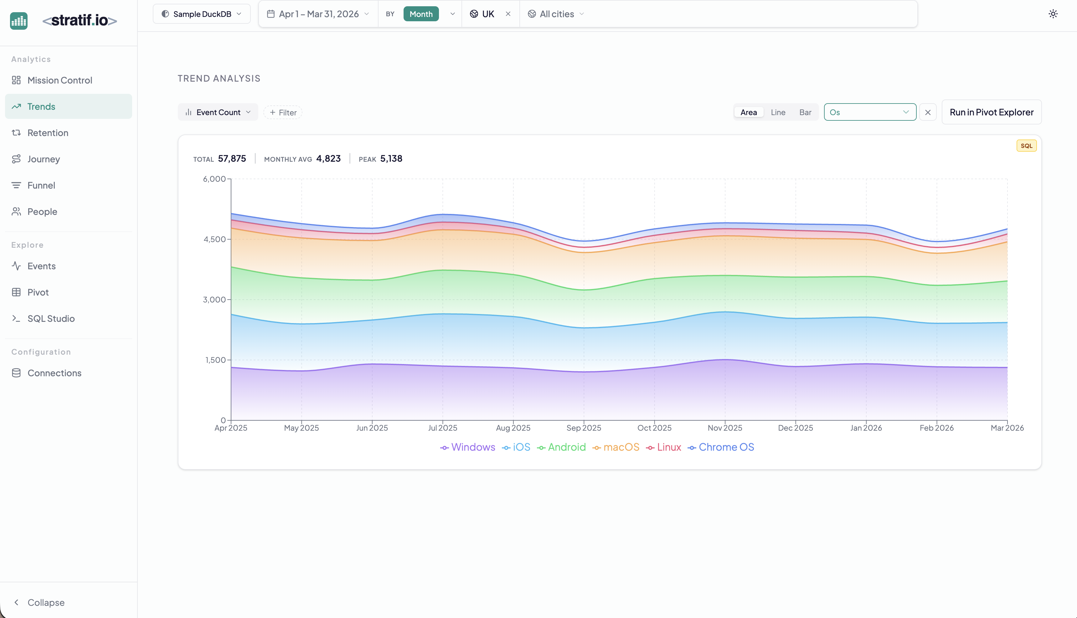
What you can measure
By default, Trends plots Event Count — the number of times any event (or a filtered subset) was fired per time bucket. You can also measure unique users who performed an event, or any numeric property aggregation (sum, average, percentile).
Breakdown
The Os chip in the example above breaks the trend line into one band per operating system. You can break down by any string property in your events table — country, device type, plan, campaign source, A/B variant.
Why it matters: An overall flat trend can hide a collapsing desktop cohort being offset by a growing mobile cohort. Breakdown reveals the composition of your trend, not just the direction.
Chart types
- Area — best for seeing proportional composition when broken down
- Line — best for comparing multiple series without occlusion
- Bar — best for discrete time buckets (weekly or monthly comparisons)
Run in Pivot Explorer
The Run in Pivot Explorer button sends your current query to the Pivot table with rows as time periods and columns as breakdown values — useful when you want a tabular view of the same data for export or deeper inspection.
When to use Trends
Use Trends when you want to monitor a single behaviour over time — feature adoption after a launch, error rate after a deployment, purchase volume after a price change, or any leading indicator you track weekly.
View the SQL
Every metric and chart on this page has a SQL badge. Click it to open the exact query stratif.io ran against your warehouse to produce that number — joins, window functions, filters and all.
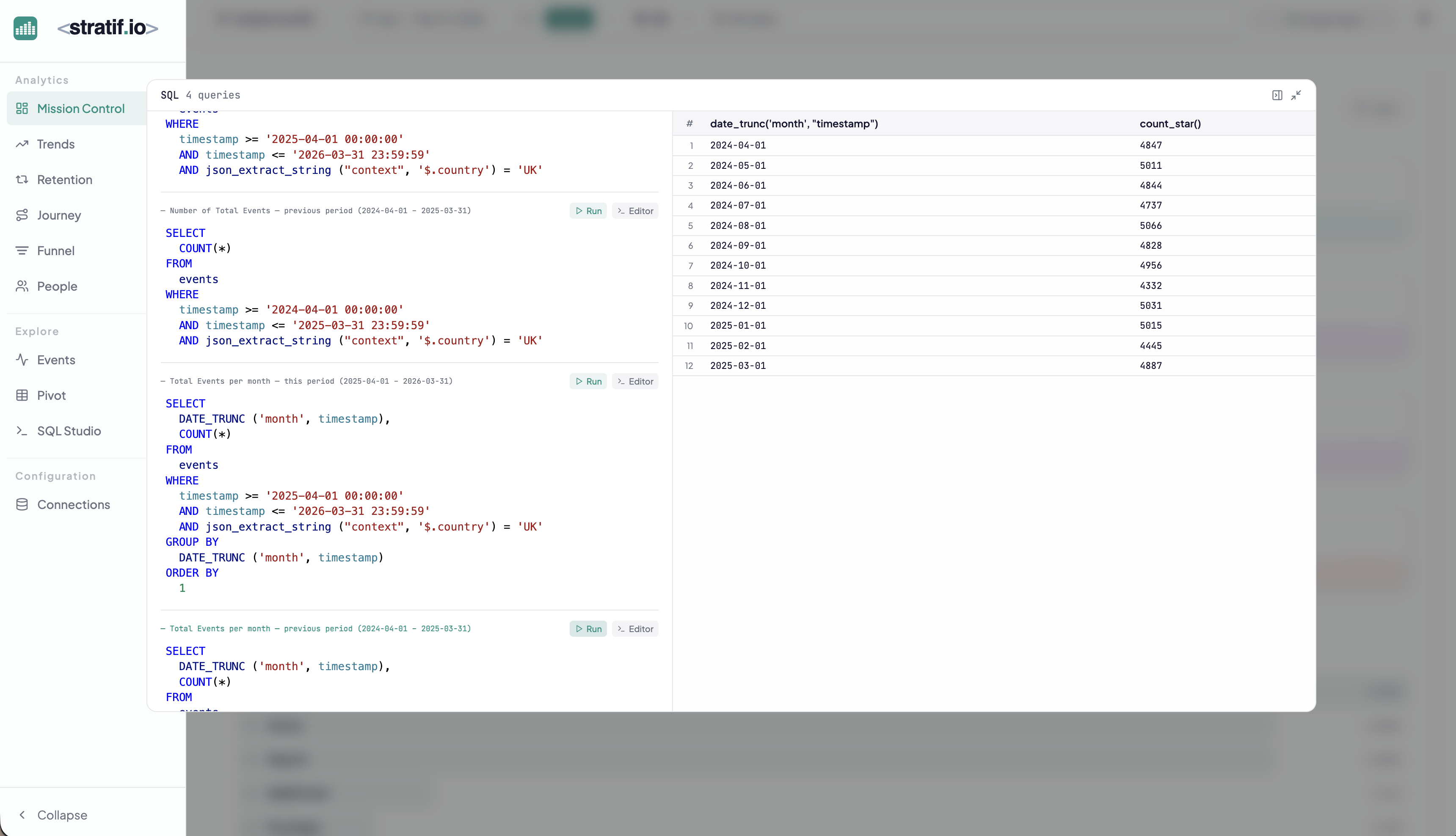
You can copy the query into SQL Studio to modify it, run variations, or use it as a starting point for your own analysis. This makes stratif.io a learning tool as much as an analytics tool: you can see how product metrics are actually computed in SQL, not just consume the results.