Pivot Tables on Warehouse Events — stratif.io
Pivot lets you slice your event data across two dimensions simultaneously — rows and columns — to spot patterns that one-dimensional charts miss.
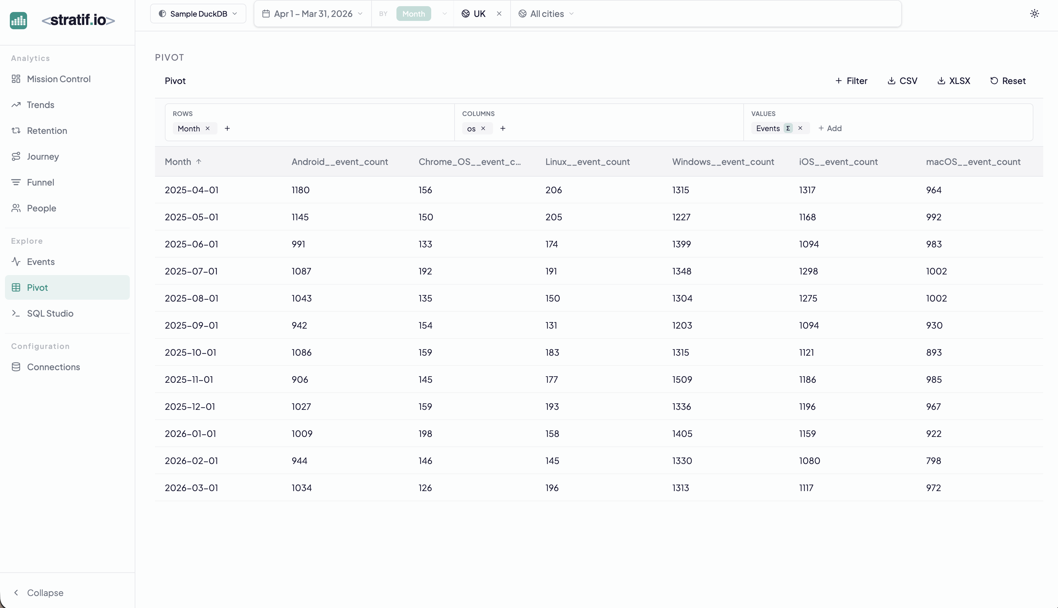
Building a pivot
- Rows — the dimension that becomes table rows (Month in the example)
- Columns — the dimension that becomes column headers (OS in the example)
- Values — the metric in each cell (Event Count by default)
Drag and drop any event property into rows or columns. Add multiple values to see them side by side.
Export
Click CSV or XLSX to export the full table. Pivot is often the last step before handing data to a stakeholder who needs a spreadsheet.
When to use Pivot
Use Pivot when you need to answer questions with two independent dimensions:
- “How does event volume break down by OS and by month?” (spot which OS is growing or shrinking)
- “How does conversion rate vary by country and by device type?” (find the worst-performing combination)
- “How does feature usage break down by plan tier and by geography?”
One-dimensional breakdowns answer one of these questions. Pivot answers both at once.
View the SQL
Every metric and chart on this page has a SQL badge. Click it to open the exact query stratif.io ran against your warehouse to produce that number — joins, window functions, filters and all.
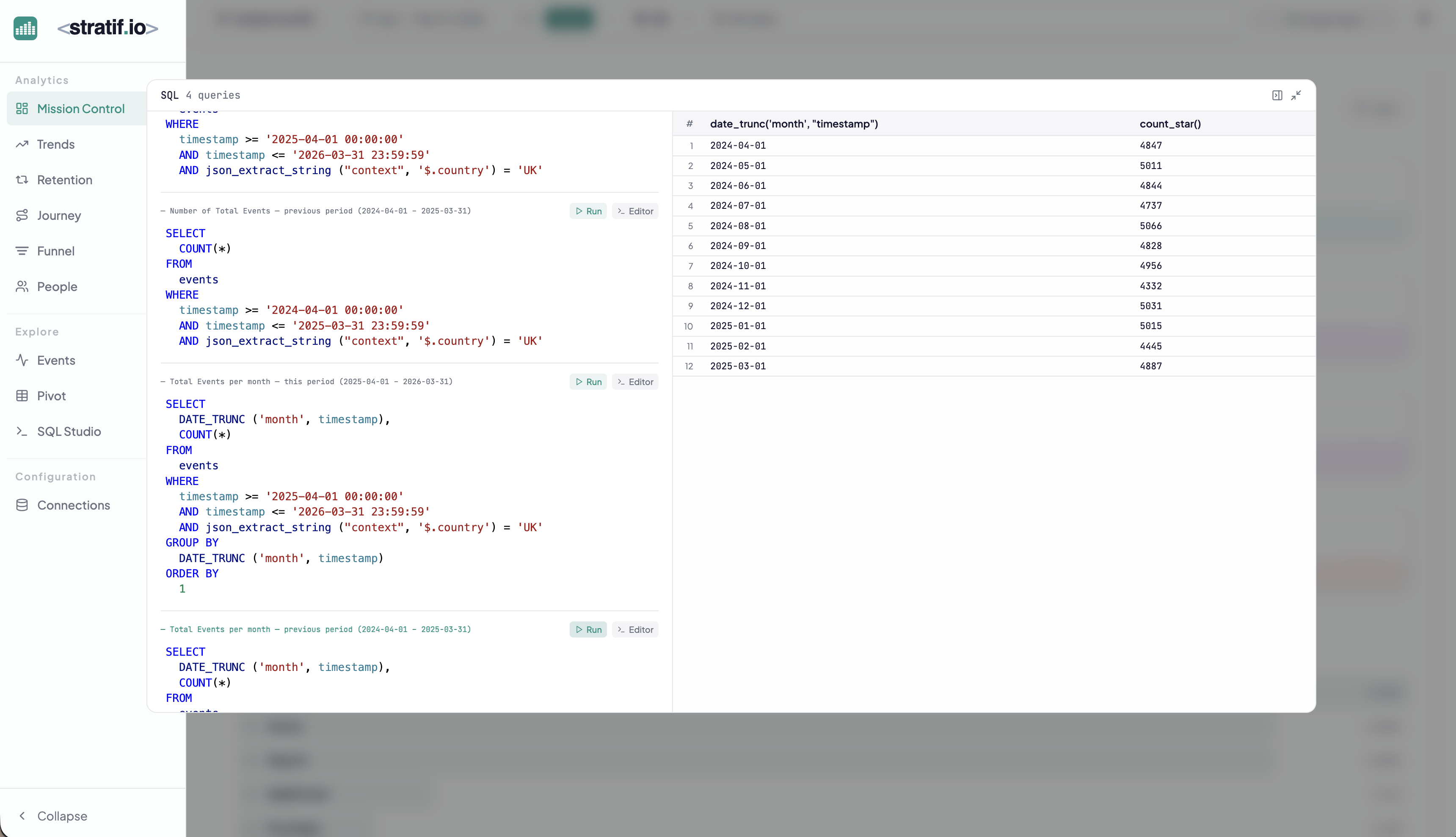
You can copy the query into SQL Studio to modify it, run variations, or use it as a starting point for your own analysis. This makes stratif.io a learning tool as much as an analytics tool: you can see how product metrics are actually computed in SQL, not just consume the results.