Retention Cohorts on Your Data Warehouse — stratif.io
Retention is the most important metric for any product that depends on repeat usage. It answers: of the users who did X in month N, what fraction came back and did anything in month N+1, N+2, N+6?
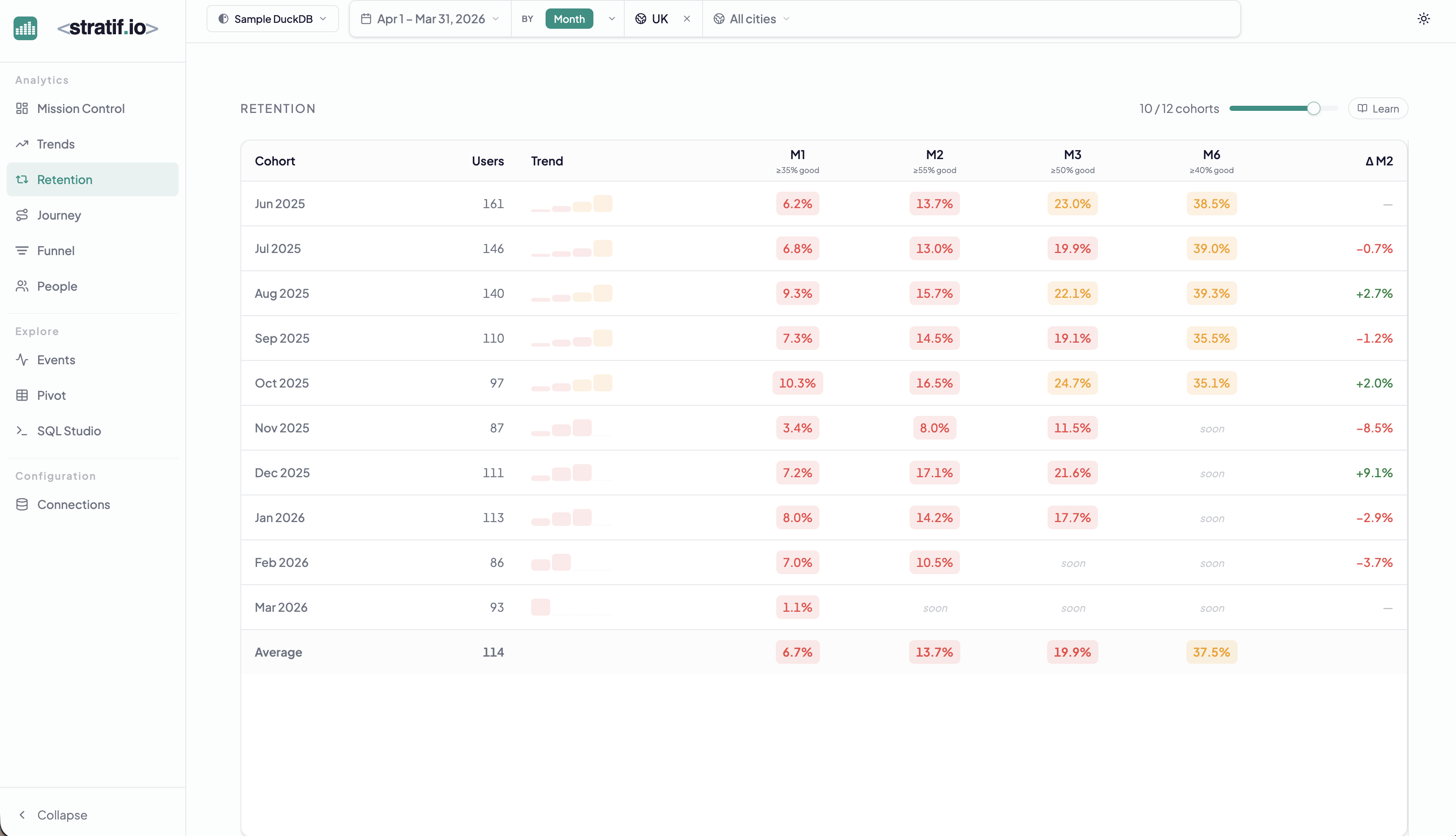
How cohorts work
Each row is a cohort — all users whose first qualifying event fell within that calendar period (month, in the example above). The columns show what fraction of that cohort was still active 1, 2, 3, and 6 months later.
The Average row at the bottom averages all cohorts, giving you a stable benchmark that smooths out seasonal variation.
Reading the colour coding
- Green cells meet or exceed the “good” threshold for that column (shown in the column header, e.g. ≥35% is good for M1).
- Red/orange cells fall below the threshold.
- “soon” means that time period hasn’t elapsed yet — the cohort is too recent for data.
The Trend sparkline
The small chart in the Trend column shows the retention curve shape for each cohort at a glance. A steep drop in M1 and then stability is normal. A continuous decline through M6 indicates users are not building habits.
ΔM2 column
The rightmost column shows the change in M2 retention compared to the previous cohort. A positive ΔM2 means your recent cohorts are better retained at the two-month mark than older ones — a sign that product improvements are working.
Why retention matters more than acquisition
Acquiring a new user costs money. Retaining them costs almost nothing. A product with 40% M1 retention and 1,000 new users per month compounds into a much larger active base than one with 10% M1 retention and 5,000 new users per month. Retention is the multiplier on everything else.
Benchmark numbers
Industry benchmarks vary by product type:
- Consumer social/content: M1 25–40%, M6 15–25%
- B2B SaaS: M1 40–60%, M6 30–50%
- E-commerce: M1 10–20%, M6 5–15%
The sample dataset in the demo shows ~6–10% M1 retention, typical for a lightweight e-commerce browsing product where most visits are one-off searches.
View the SQL
Every metric and chart on this page has a SQL badge. Click it to open the exact query stratif.io ran against your warehouse to produce that number — joins, window functions, filters and all.
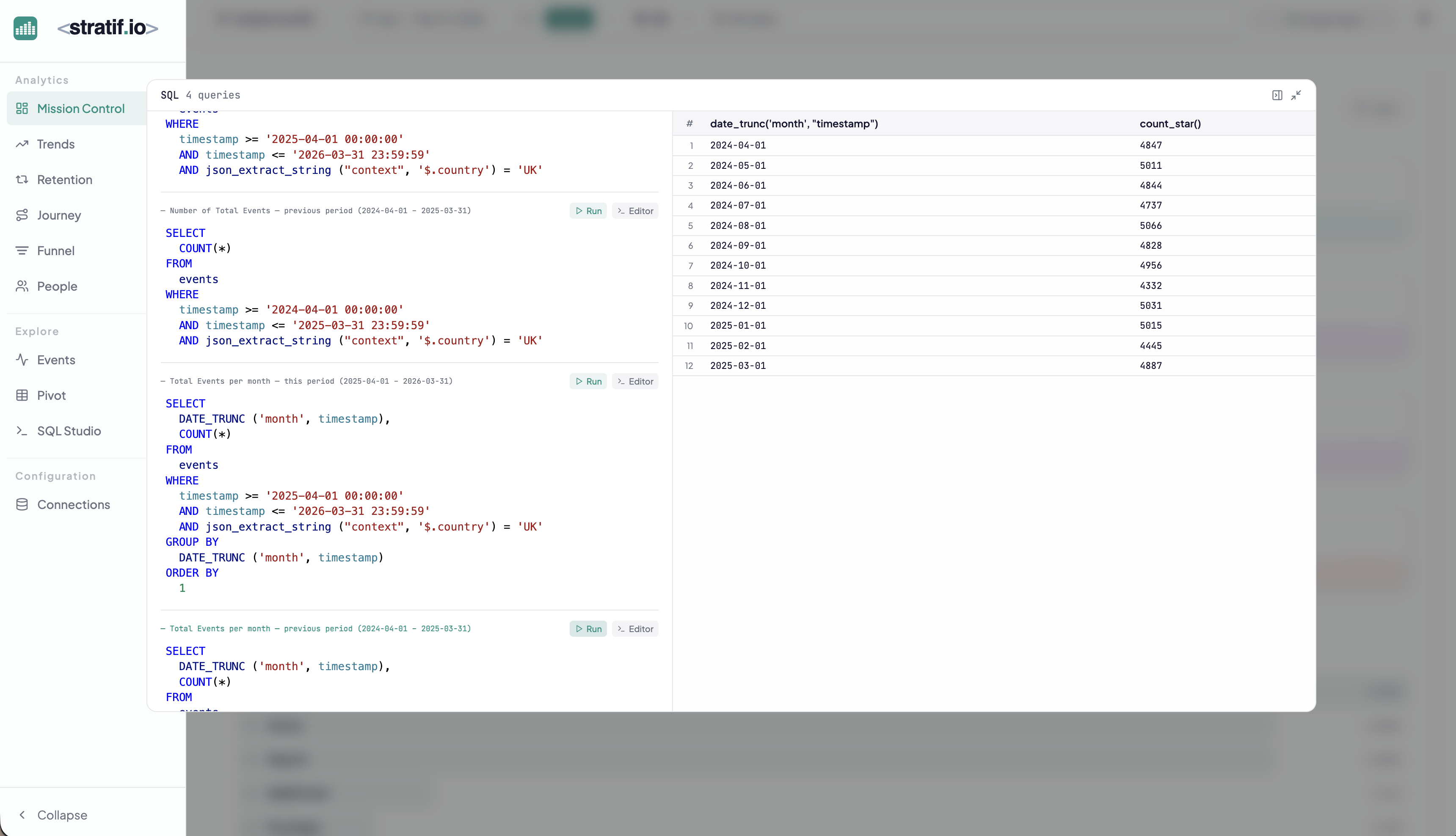
You can copy the query into SQL Studio to modify it, run variations, or use it as a starting point for your own analysis. This makes stratif.io a learning tool as much as an analytics tool: you can see how product metrics are actually computed in SQL, not just consume the results.